Legacy code has a reputation for being messy, outdated, and a reliable source of frustration. Could you ever imagine legacy code being something to be proud of, or at the very least, not a burden on you and your team?
What if we approached writing code in a way that it remains useful, maintainable, and even beautiful? In the pursuit of solving yet another immediate business need, developers often find themselves building a specific feature to tackle said request. Whether due to lack of experience, deadlines, or other factors, these features are sometimes treated like one-off products, a quick fix: built, delivered, and then set aside.
However, considering that the developers will be the ones maintaining and possibly expanding the feature later, this decision is worth rethinking before implementation. I’ve seen countless examples where processes could have been streamlined right from the start by designing even the smallest feature for future potential reuse.
In this article, we’ll explore how to shift towards a more long-term mindset when dealing with code. As a seasoned front-end developer, I’ll use examples from React to demonstrate how thoughtful planning can save time and effort down the road. My goal is to showcase the idea itself, while the exact technology or the field where you apply this idea is secondary.
Let’s dive into how you can make your code not just survive but thrive, long after it’s written.
Building components
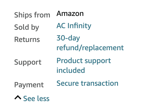
Let’s start with a simple example. Suppose you are developing a marketplace. The business gives you the task of making part of the supplier’s data on the product card visible immediately, while the rest is hidden under a “See more” link. This, when clicked, reveals the hidden information, with an option to collapse it again via a “See less” link. For instance, you can find this functionality on Amazon product cards:


At first, it may seem like a simple task. You set up a flag in the product card component’s state, style the link, add an icon depending on the flag’s value, and add a click handler to toggle the flag. And, hide part of the information if the flag is false. Done, right? Not quite.
I’ve chosen a task seemingly minuscule to illustrate a key point: even simple features have room for a more flexible approach. Before you dive head-first into implementation, it’s worth stepping back and asking, “Will this feature be needed elsewhere?”
In modern marketplaces, where too much information can overwhelm users, it’s likely the business will want to reuse this feature. If we handle it as a quick fix, we may end up copying and pasting the same code across multiple components, which brings its own set of problems, like maintaining consistency and updating multiple places when change is needed.
Switching an icon, for instance, will require you to manually update it in every instance where you implemented that feature. If the business wants to add animation, you’ll need to deal with that too. Even if no changes are needed, the mere fact of copy-pasting code should raise questions.
The solution is simple, and you likely already know it: extract all of this into a separate component. But my point isn’t just about refactoring code as needed — it’s about writing code that doesn’t need refactoring at all.
Instead of focusing on hiding supplier information in one place, why not tackle the broader issue of “hiding content” right from the start? What if, from the very first use, we create a separate component, even if it’s (for now) the only place where this component is needed? Here’s an example:
| import { useState, PropsWithChildren } from ‘react’; import { Icon } from ‘~/components’; interface Props { labelForCollapsed?: string; labelForShown?: string; } export const Collapsable: React.FC<PropsWithChildren<Props>> = ({ labelForCollapsed = ‘See more’, labelForShown = ‘See less’, children, }) => { const [isCollapsed, setIsCollapsed] = useState(true); const toggle = () => setIsCollapsed((isCollapsed) => !isCollapsed); return ( <> <span onClick={toggle}> <Icon icon={isCollapsed ? ‘chevron-down’ : ‘chevron-left’}/> {isCollapsed ? labelForCollapsed : labelForShown} </span> {isCollapsed && (<div>{children}</div>)} </> ); }; |
Here you go – a component that addresses a more general problem and can be reused whenever needed.
Dissecting a feature
But, let’s delve deeper, with a more complex example. Once in a while, every developer is met with the need to build a dropdown component for selecting items. However, this, while seemingly simple, requires much more than just the selection functionality:
- Styling according to design specs.
- Storing and rendering options.
- Handling option clicks and updating the state.
- Supporting single or multiple selections.
- Correctly highlighting the chosen option in the list.
- Ensuring the dropdown appears correctly in the UI layout.
- Adding search and filtering features for long option lists.
- Implementing autocomplete, with server-side fetching and debouncing requests.
- Cancelling server requests as the user types, but avoiding a request for each character, to prevent spamming the server.
And that’s just the beginning. I know that many developers dive into implementing this functionality directly into the component. However, if we break it down, most of these features aren’t specific to the dropdown component, and we can group them as follows:
- Items 2, 3, 4, 5: functionality responsible for selection.
- Item 6: rendering a container over other elements.
- Items 7, 8: loading data from an API and displaying a loader and error state.
- Item 9: debounce logic.
Here, only item 1 is specific to our select component. So, what if we dare to implement the features from the groups separately? It’s clear that this “select” functionality is not limited to the select component. Let’s go back to Amazon for a second:

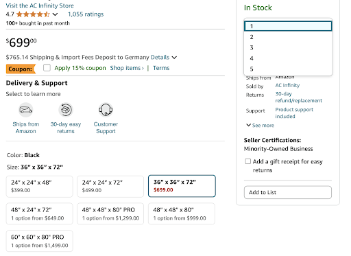
On a single product card, we can spot at least three different selection mechanisms:
- A simple single-select for quantity.
- Checkboxes for “Apply 15% coupon” and “Add a gift receipt for easy returns.”
- Tile-based options for product modifications.
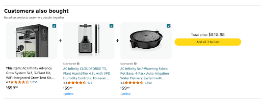
And if you scroll further, you’ll also find a multiselect for adding multiple items to the cart:

So, why not implement selection functionality in an abstract way? In React, hooks are just perfect for this.
| import { useEffect, useMemo, useState } from ‘react’; export interface SelectorSelectEvent<TItem> { selected: TItem[]; isSelected: boolean; item: TItem | undefined; } interface Props<TItem> { items: TItem[]; getItemKey: (item: TItem) => string; multi: boolean; selectedKeys: string[]; onSelect?: (event: SelectorSelectEvent<TItem>) => void; } export const useSelector = <TItem, TContext>({ items, getItemKey, multi, selectedKeys, onSelect, }: Props<TItem, TContext>) => { const [selectedMap, setSelectedMap] = useState<Record<string, TItem>>({}); const buildMap = (candidateKeys: string[] = []): Record<string, TItem> => candidateKeys.reduce( (memo: Record<string, TItem>, candidateKey: string) => { const item = items?.find((item) => getItemKey(item) === candidateKey); const selectedItem = item ?? memo[candidateKey]; if (selectedItem === undefined) return memo; memo[candidateKey] = selectedItem; return memo; }, {}, ); const getSelectedItems = ( selectedMapToCheck: Record<string, TItem> ): TItem[] => Object.values(selectedMapToCheck); const selectedItems = useMemo<TItem[]>(() => getSelectedItems(selectedMap), [selectedMap]); useEffect(() => { const newSelectedMap = buildMap(selectedKeys); setSelectedMap(newSelectedMap); }, [selectedKeys]); const performSelect = (newSelectedMap: Record<string, TItem>, isSelected: boolean = false, item?: TItem) => { const selected = getSelectedItems(newSelectedMap); onSelect?.({ selected, item, isSelected }); }; const getIsSelected = (selectedMapToCheck: Record<string, TItem>, item: TItem): boolean => { const key = getItemKey(item); return key in selectedMapToCheck; }; const toggle = (item: TItem): Record<string, TItem> => { const key = getItemKey(item).toString(); if (!multi) return { [key]: item }; const isSelected = getIsSelected(selectedMap, item); if (isSelected) { const { [key]: omitted, …restSelectedMap } = selectedMap; return restSelectedMap; } return { …selectedMap, [key]: item }; }; const select = (item: TItem): void => { const newSelectedMap = toggle(item); const isSelected = getIsSelectedInternal(newSelectedMap, item); performSelect(newSelectedMap, isSelected, item); }; return { selectedItems, select, getIsSelected, }; }; |
This hook can now be used in the examples mentioned above, letting you focus on the feature’s appearance and user experience rather than selection logic. Even better is once you have the unit tests down, you will have covered the selection functionality across your entire project! Similarly, you can implement functionality for dropdowns and data loading based on user input. This way, you can focus on how your designer envisioned the dropdown and assemble it from feature bricks which are already there.
By following an approach where you first create tools for more general tasks and then use them to solve specific ones you build a toolbox for solving virtually any problem in your project and beyond. Plus, this toolbox is independent of your designer’s ideas!
Reconsider everything twice
However, this approach isn’t without its missteps. For example, in one of my projects I proposed using custom mixins for SCSS files to build selectors using the BEM methodology and insisted on their widespread use:
| /// Block Element /// @access public /// @param {String} $element – Element’s name @mixin element($element, $blockRef: null) { @if $blockRef { #{$blockRef}__#{$element} { @content; } } @else { &__#{$element} { @content; } } } /// Block Modifier /// @access public /// @param {String} $modifier – Modifier’s name @mixin modifier($modifier) { &–#{$modifier} { @content; } } |
It seemed convenient at first. We defined a separator for elements and their modifiers in one place, but over time, it became clear that this was a mistake. I had essentially just created an alias for something that SCSS can already handle. On top of that, the idea of having a single place to define the separator turned out to be pointless. It’s hard to imagine a situation where we’d need to change these separators, and even if we did, we could just do a search-and-replace across the whole project at once and forget about it.
So, instead of rushing to solve a task, I suggest asking yourself a few questions:
- Is this really a one-off feature, or could it show up elsewhere?
- Could this feature appear in a different design?
- Can we break this complex feature into smaller, simpler pieces?
If the answer is yes to any of those, then let’s go ahead and do what we just talked about! Over time, you’ll have solutions to specific problems and reusable code snippets ready for future tasks. And here’s the best part. We’ve solved a bigger problem without realising it: when our code becomes “legacy,” it will still be useful and well-structured. It’s the kind of code that will never leave you embarrassed, and that you’ll actually want to carry over from project to project.
Approaches that work
This approach benefits not just developers. As an architect, I often have to create tools that solve broader problems, which the team and I can later apply to specific tasks. By shifting our mindset from creating isolated features to building reusable, scalable components, we can create an ideal environment for lasting, stable success. This solution saves time and effort, making code more maintainable, adaptable, and much easier to extend. So, the next time you’re faced with a new feature, pause for a moment. Ask yourself: how can I solve this in a way that will benefit both today and tomorrow?
The investment in reusability always pays off in the end.
Egor Grushin
Senior Software Architect, MTS Digital

Egor Grushin is a Senior Software Architect with over 11 years of experience in software development and architecture for high-load B2B and B2C projects. He specializes in JavaScript, MongoDB, and Kafka, with a proven track record of designing and implementing scalable systems. Passionate about tackling complex challenges, Egor thrives in dynamic environments that require innovative solutions. He is also an experienced mentor, providing guidance to colleagues of all seniority levels.

